John Beard is an artist who has led an adventurous life, leaving Britain in the early 1980s to teach in western Australia, then settling in Sydney, while at the same time showing his work all over the world — in New York and Delhi, Madrid, Melbourne, New Zealand, London, Lisbon and St. Ives.
I first got to know him in the late 1990s, when a work of his, Wanganui Heads, was included in an exhibition at the National Portrait Gallery, Painting the Century, held to celebrate the millennium in 2000. In 2007, he won the Archibald Prize, the leading prize for portraiture in Australia and, in some ways, the world, since it is a prize of such long-established prestige, centre stage in the Australian art world in a way that the BP Portrait Award never has been. But he is not a portrait painter, any more than he is a landscape painter. He’s a painter of disappearing and sometimes ephemeral appearances — images which hover in a space somewhere between realism and abstraction, half real, half remembered, highly composed, but, at the same time, loosely brushed and ill-defined, not as seen, but touched, transmuted, as the ghost of physical appearances.
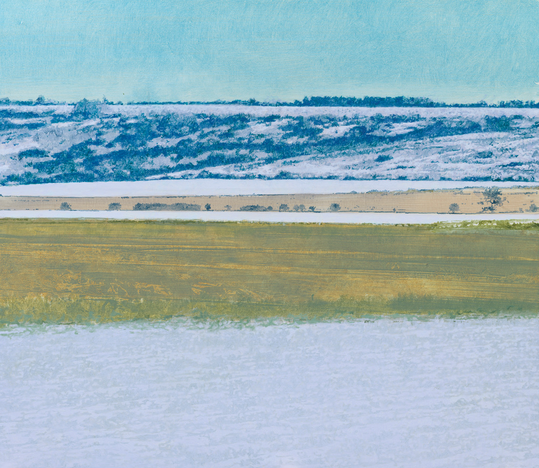
In the midst of this peripatetic and transient life, he arranged to rent a cottage in October 2020 in the heart of the Wiltshire countryside, due west of Salisbury, looking across fields and farmland towards a line of hills of the south Wiltshire Downs. Then came another COVID lockdown. He and his wife, Wendy, were trapped in Wiltshire by the epidemic, not allowed to meet people, not allowed to leave. They had only the view of the distant hills for company.
Out of this period of being stuck in the English countryside, he has produced a body of work which is intensely atmospheric and solitary, the landscape of fields and hills half seen, half absorbed into his imagination and then idealised into views of the snow and the mist, the wintry hills and the outlines of the distant trees along the horizon and the ploughed-up fields in diagonal lines stretched across the foreground, sometimes covered in a light dusting of snow.
He works in watercolour, too, as did Turner: watercolour which is such a wonderful medium for the depiction of atmosphere, because it is done at speed and cannot be over-worked. Again, you see the distant line of hills trailing off into the left-hand horizon; the evening light as the trees and fields merge, the only definition provided by the line of trees on the horizon, or, occasionally, one lone tree in the middle distance, providing an incident in an otherwise featureless landscape. Sometimes you can feel him sitting down and wanting to catch the last of the evening light in the watercolour.
Landscape is a difficult genre in the modern world, as is portraiture. It’s been too hackneyed, perverted by the ease and instantaneity of photography, so that it is hard to convey the restfulness of nothing, the subtleties of light, so ethereal, so liquid and imprecise.
Hovering, shimmering, transient. This is not conventional English landscape, but is instead both ordinary and epic at the same time; one piece of countryside, the south Wiltshire downs, seen over and over again as the months of COVID meant that there was no possibility of further exploration, only of enjoying and appreciating what is there — looking at it, thinking about it, visualising it, recording it, always the same, which for a period of time, six months, was all that he had to depict, no people to talk to, just fields and the distant line of downs.
Sir Charles Saumarez Smith CBE is a British cultural historian specialising in the history of art, design and architecture. He was the Secretary and Chief Executive of the Royal Academy of Arts from 2007 until 2018.

By Catherine Milner
Satire has always been a key feature of British art; from Hogarth to Spitting Image, Gillray to Banksy, artists in this country have for centuries lampooned hypocritical politicians or dim-witted dignitaries with glee.
In this respect, Stephen Dixon stands in an heroic tradition. But perhaps what makes him unusual is the scope of his savagery.
Unlike those artists from the past who mostly attacked British statesmen and British aristocracy while occasionally swiping at the French or Americans, Dixon takes aim at leaders from across the globe, from Donald Trump to Aung Sang Suu Kyi or when he was alive, Saddam Hussein.
His work targets the oil industry, the refugee crisis, slavery and asylum issues, echoing in his range, our change from imperialists to political activists and sometimes, bungling interventionists.
Born in 1957 in Peterlee in County Durham – a post-war town named after a social reformer bent on ending squalor – Dixon was steeped in politics from an early age; he is the son of a teacher who was an active member of the Labour Party and the grandson and nephew of a tribe of coal miners.
‘From the start I was never interested in making functional pieces, and more interested in telling stories and making statements’ he says.
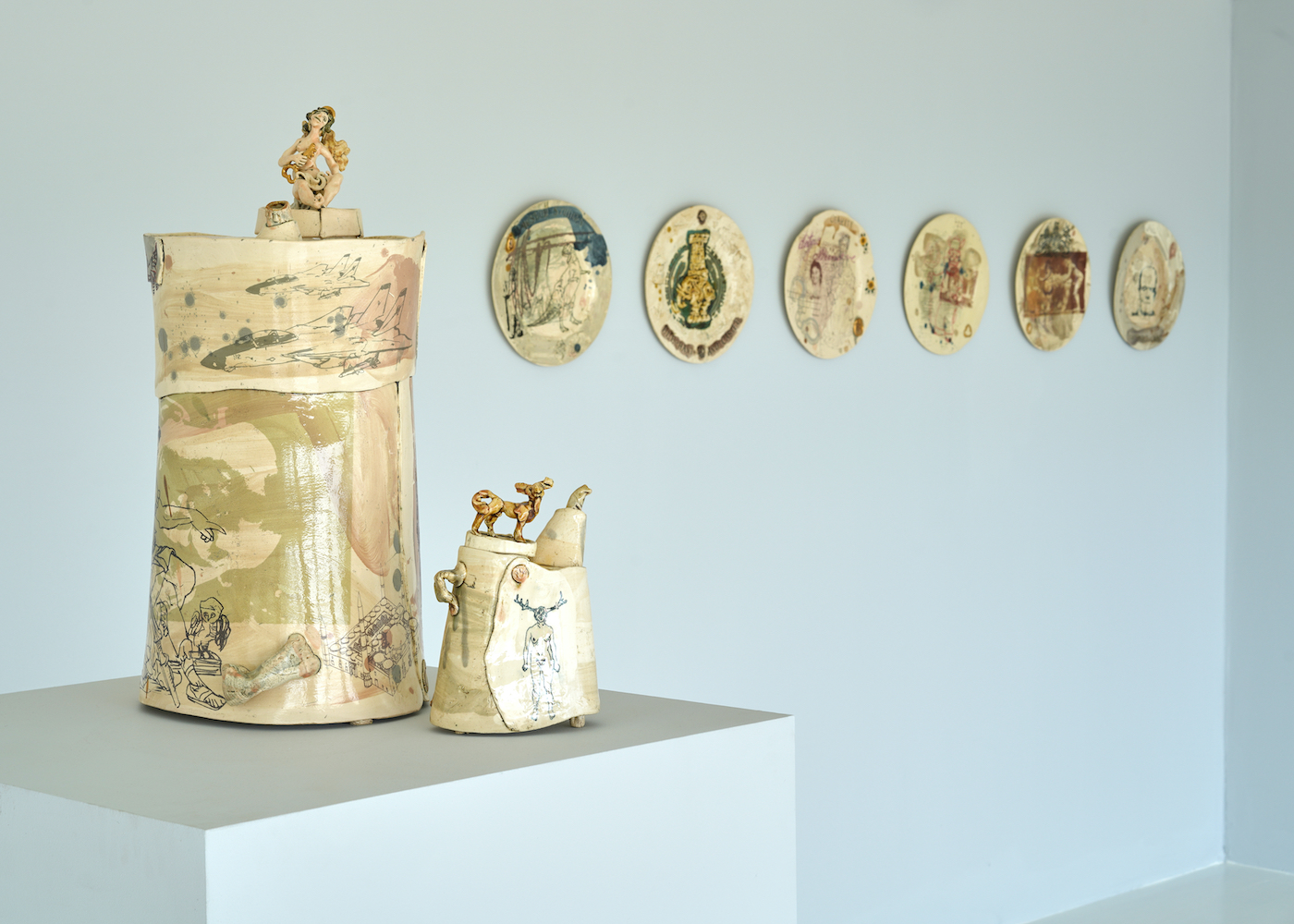
One of the highlights of this show is a series of oil cans made in clay highlighting the folly of the Iraq War.
Although the same size as a real oil can, Dixon’s are wonky and plastered with images of Frankenstein – ciphers for the monster he thinks the West created in the Middle East with their initial support of Saddam Hussein – as well as icons of American audacity and derring-do like Charlton Heston pictured on a gas-guzzling motorbike.
Robustly modelled, with handles like cuffed ears, spouts like snouts and featuring an array of jaunty clay odalisques lying on top, these vessels have a strong physical presence that is complemented by the gauzy, photographic images wrapped like clothes around their trunks.
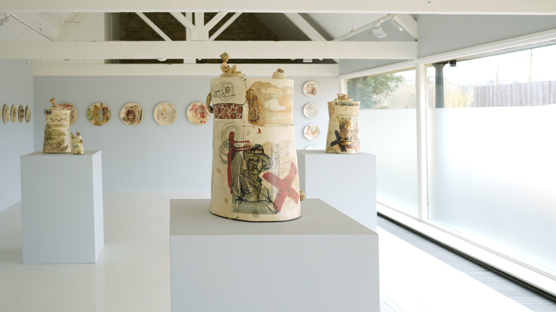
In works as bitingly accusatory as they are friendly to look at, icons of Eastern culture like the Kama Sutra, the tombs at Petra or the defaced Bamiyan Buddhas are superimposed with highlights of those from the West; the Laocoon, Michelangelo’s David and flocks of US fighter jets.
‘I want to draw attention to the highest and lowest forms of civilization in each kind of culture,’ explains Dixon.
Although more of a teapot than an oil canister, a particularly caustic piece in this show is a vessel decorated with a drawing of Diana, Princess of Wales presented as the Hunted rather than the Huntress with antlers on her head. Hounded by dogs Dixon has graphically drawn her womb – making the point that her main function was to bear an heir to the throne.
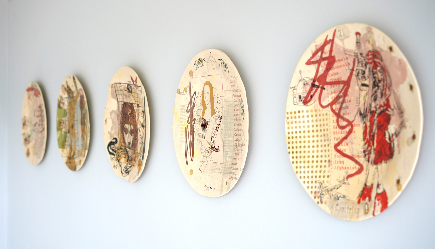
Another remarkable work decorated with a picture of a teenage girl brandishing a Kalashnikov is called 21 Countries – a reference to the number of nations bombed by the Americans since the Second World War.
It is not just America that seems to provoke Dixon’s ire, however. Recently he has turned his attention to the migrant crisis, seeing a parallel between the journey of Majolica – the tin glazed wares – and that of refugees.
Originally from North Africa Majolica spread through Italy, France and the Netherlands before finally arriving in England in the form of English Delftware.
In this exhibition are a series of tin-glazed plates which feature a dazzling array of contemporary hieroglyphs – both positive and negative. In no particular order appear some handcuffs, the lion and the unicorn coat of arms, a dominatrix holding a whip, Homer Simpson holding a trident, Donald Trump as a winged dinosaur; Carl von Ossietzky winner of the 1935 Nobel Peace Prize and perhaps most fittingly of all, a double portrait of Pandora, opener of the famous Box.
Having studied Fine Art at Newcastle University and Ceramics at the Royal College of Art in the 1980’s, Dixon became Senior Research Fellow in Contemporary Crafts at Manchester School of Art in 2003, becoming Department head and Professor of Contemporary Crafts since 2007.
Doggedly committed to a form of art that has been pretty unfashionable during the last fifty years, he has ploughed his own furrow with exceptional zeal, maximising the impact of his work by learning how best to apply water-based screen printed transfers to ceramics – attending universities and colleges in Edinburgh, Cork, Beirut, even Australia to become one of the world leading practitioners in this technique.
Dixon and Carol McNicoll – another questioning ceramicist also in this exhibition – and the likes of Grayson Perry and Edmund de Waal prove beyond doubt that contemporary painters, rightly lauded for their powerful polemic do not have the stage to themselves any more.
The difference is that contemporary ceramic can form the centrepiece of your table as well as your wall.
‘My career as a maker is defined by a commitment to politically engaged practice, and a belief in the power of craft to inform the public imagination and to make a difference,’ says Dixon.
In its technical skill, aesthetic and sensual allure and powerful narratives, Dixon’s work engages us on many levels chief of which seems to have been as a harbinger of the formidable new political age we have suddenly entered.
by Catherine Milner
Last November a record price for ceramic – £240,000 – was set for a pot by Magdalene Odundo, one of a group of ceramic artists that Messums are showing in March.
The clay pot has been a means of human survival for thousands of years; its decorations, engravings and embellishments offering an intimate record of how people have lived.
And although the market for the finest of ceramics still lags way behind that of the ‘fine art’ market and artists like Jeff Koons whose stainless steel Rabbit sculpture sold a couple of years ago for $91 million, the fact that they are being valued increasingly highly tell us a great deal about the seismic shift our culture is undergoing.
One might have expected a humble vessel made simply of clay to have become artistically obsolete with such a wide variety of technical innovations and novel materials available to artists.
But quite the contrary.
To generations brought up within an education system that prioritises working on computers rather than with their fingers and imagination, clay can seem exciting – almost anarchic.
Clay vessels reconnect the viewer with the ground beneath our feet; perfect ciphers for our new awareness of the fragility of the earth that like a pot itself, must be handled with care.
Over the last five years Messums has been tracing the evolution of this new movement with as many as thirty exhibitions and festivals focused on clay, culminating last year in Beyond the Vessel, one of the biggest exhibitions of contemporary clay sculptures to have been held anywhere in the world.
Shown firstly at the Mesher Gallery in Istanbul and then at Messums in Wiltshire, the exhibition brought together thirteen sculptors from seven European countries – each expressing different aspects of European myths and folklore in clay.
This exhibition brings us back to the vessel and highlights the pivotal role that the Royal College of Art in London has played in leading the renaissance of art using clay. Almost all the artists in it went to the RCA in the 1970’s ; a place that coupled the teaching of stringent technical disciplines with lively intellectual debate resulting in works that are exquisitely executed with compelling narratives to boot.
Having been educated in Kenya, the ‘narrative’ of Odundo’s work lies more in the shape and style of her works than any explicit drawings or words but a narrative is there nonetheless.
All her pieces, including the two we have on display, reveal the natural shapes of the human body – the pot belly, the curves of the spine, the hair – abstracted, burnished and formed into vessels.
A perfect piece of abstract art embodied in the most ancient form of utility.
‘Using the human form is a very natural way of sculpting with clay’ she says. ‘After all, the Bible says that God took clay and used it to form man. It’s something that is within our culture. The first thing you do as a child is get a piece of clay, squeeze it into your hand, add bits and pieces, then draw an eye or a mouth on to it. Clay automatically lends itself to making. It is embodied into the motion of making a body, a person.’
There are elements of human form in the works of Alison Britton too. Not only in the jug eared handles of her platters or the jaunty arms of some of her pots but in their uneasy stances; their craning necks or lopsided shoulders making them studies in the awkwardness of human beings for which clay acts as such a wonderful simulacrum. Not for her symmetrical forms and mathematical precision of some of the other pots in this show, but intuitive ‘flicks, squirts and slips.’
‘An unfired pot is naked; its needs something happening to it, like a body needs a dress,’ she says, challenging herself to make the painting on a pot in an unpremeditated fashion, less like patterning and more like an abstract painting in which the canvas is slabs of clay.
In Japan and Korea, ceramics represent a zenith of cultural expression, thanks to their ability to convey unique styles, customs, and politics within their form.
The Confucian ideals of frugality and purity has become a defining symbol of Korean and Japanese potters and running in tandem with our show of pots by British makers are works of the most exquisite perfection by Korean master Ree Soo-Jong and next month, by the Japanese artist, Makoto Kagoshima. A British equivalent is the work of Martin Smith, whose early works were large raku bowls which were precise and geometric, departing from the tradition of Japanese raku but keeping nonetheless their sense of purity.
His works in this exhibition play with perspective and reflection, surface and depth. Inspired by architecture they turn away from the malleability of clay, forcing it instead into angles of geometric precision.
Smith is Senior research Fellow of Ceramics at the RCA, where he is investigating
the ‘Potential of the Digitally Printed Ceramic Surface,’ and many of his works mimic other materials like wood, silver or gold in a way that clay objects have for centuries been skeuomorphs.
Although Steven Dixon has made several research trips to Japan, his way of working could not be more different, manifesting one of the enduring characteristics of British art – satire. From Hogarth to Spitting Image; Gillray to Grayson Perry, the British have always used wit to puncture authority and lampoon social vices.
He is currently working on a project that traces the history of Majolica; the type of tin-based glaze that is best known as coming from Italy but in fact originated in North Africa which spread throughout Europe until it appeared in England in the shape of English Delftware; using this trajectory of travel as a metaphor for the journey undertaken by refugees.
On one of his plates Mona Lisa brandishes a Kalashniko; on another, Michaelangelo’s David is woven with images of Palmyra after it was ruined by terrorists; totems from both ‘the highest and lowest points of civilisation,’ he says.
There are also a series of magnificent oil cans by Dixon made of clay, each standing at least 60 cms high and therefore actual size. They were made in the 1990’s during the time of the Iraq Wars and expose the hypocrisy of the West as it created a Frankenstein’s monster in the shape of Saddam Hussein and turned The Holy Land into a group of basket states.
Closer to home are the satirical works of Carol McNicoll, which include a ‘Non Socially Distanced’ Toby jug plastered with images of her friends, dancing, abseiling and sitting in the pub. She has also made a vase dedicated to the area of North London in which she lives called The Heath which subverts its reputation as a place for gay men to congregate by featuring an image of a bewigged and stockinged 18th century courtly gentleman bowing in front of a lady.
Back in ancient Greece pots recorded all sides of life from drinking games to gladiatorial wrestling matches to combing your hair. Thousands of years before that, they told us how Neolithic man worshiped, cooked and travelled around meeting with other tribes.
It is this ancestry of pots; their familiarity to us as domestic ally coupled with them being the nearest equivalent to our own bodies as vessels for our souls, that makes them particularly compelling at such a time of threat.
RELATED LINKS:
by Catherine Milner

Born in Reykjavík, Iceland, Haraldsdóttir’s works are inspired by Nordic pattern and folklore. Her family was originally from a small village on the Snaefellness Peninsular called Olafsvík in the shadow of the celebrated twin peaked glacial mountain that inspired Jules Verne’s novel Journey to the Centre of the Earth.
The patterns on her ceramics echo the distinctive black and white designs of Icelandic woollen garments, rugs and tapestries, inspired by snow, nets and other crystalline and geometric forms.
Having graduated with a Masters degree and the Silver Medal for Architecture from Glasgow School of Art she studied at the Hochschule der Kunst in Berlin before practising professionally as an architect in Reykjavik, Edinburgh and London.
 She turned to ceramics as a way of creating ‘small architecture’ in a hands-on manner in response to the bureaucracy and meetings with lawyers, legislators and engineers that comprises much of an architect’s day-to-day life.
‘I have now worked as a ceramic artist for longer than it takes to become an architect’ she says. ‘Clay has replaced steel and glass, but I still work as I was trained; pieces are planned and drawn before they are made and made as they are conceived.’
Her sculptures are mostly built in stoneware clay and painted with slip; black on stoneware or sometimes white on lava stone. This is then scraped back to reveal the base material in two-tone monochrome patterns, occasionally joined by a mid-tone painted slip to create more complex geometries. The scrape marks are visible, and the surface is a plane of shallow relief, like an elaborate braille; the tactile nature of Haraldsdóttir’s work is important – they are an invitation to touch.
‘The works are a conversation between the pseudo -perfection of geometric pattern and the tactile impurity of hand-manipulated clay’ she says. ‘They are not sterile and porcelain-perfect but visceral mini monoliths, which have layers of complexity built into superficially simple constructions.’
She deliberately creates warped planes through careful pattern cutting and jointing of would-be flat slabs so that vessels become subtly off-kilter.
The strong patterns on them tend to anaesthetise first impressions that they are organically shaped and made from organic materials but the play of light, even across matt surfaces belies a more expressive form.
People are generally afraid of handling ceramics but Haraldsdóttir’s works invite quite the contrary reaction. She creates cushions of clay that sometimes encapsulate loose clay beads that create ‘roulette wheel’ sounds when held and handled.
‘Some of my pieces are ‘participative ceramics’ she explains;
‘I am particular about the cuts and punctures I make in my vessels. Letterbox openings allow the soul of each piece to come and go as they please.’
Interview by Crafts magazine

Crafts magazine: How does it feel to have won Blown Away, and what happens next?
Elliot Walker: It’s still sinking in. We actually filmed it a year ago, so I’ve had to keep shtum since then, but the past week has been crazy and I’ve had lots of support. People over here think it’s amazing that someone from the UK has won a US-based show.
As the winner of Blown Away, I was awarded a residency at the Corning Museum, which I’m hoping to do in the autumn, as well as another at the Pittsburgh glass centre. I’m hoping to use those to make work for an exhibition I have planned at the Habatat Galleries in Detroit, the flagship glass gallery in the US.
The American studio glass scene is much bigger than the UK’s. Did you notice a difference?
 Yes, it’s unbelievably different there. One thing I learned is how many institutions they have dedicated to glass – a lot of them with charitable status, so people from underprivileged or challenging backgrounds can go and learn the craft. Glassblowing needs a lot of discipline so I can see how it might change your perspective or your emotional state. A lot of artist there make their work by doing projects with different institutions. I hope people in the UK can start to understand what we’re losing in terms of craft, heritage, history, skills and contemporary practice without publicly funded institutions for glass making.
Why do you think you won the competition?
A lot of it was luck – the other contestants were fantastic. I think had the advantage of diversity – because I’m a sculptor more than traditional glassblower, I could come up with different forms quite easily, which gave me an edge.
In your current online exhibition with Messums London you’re showing a new body of work, ‘Plenty’. How does this series draw on traditional still-life paintings?
I’ve been working with glass for 12 years, always experimenting with different techniques. But I’m also influenced by historical works of art. Here, the 3D forms take inspiration from still-life paintings, their composition and depiction of expendable objects.
How do the works comment on our relationship to food?
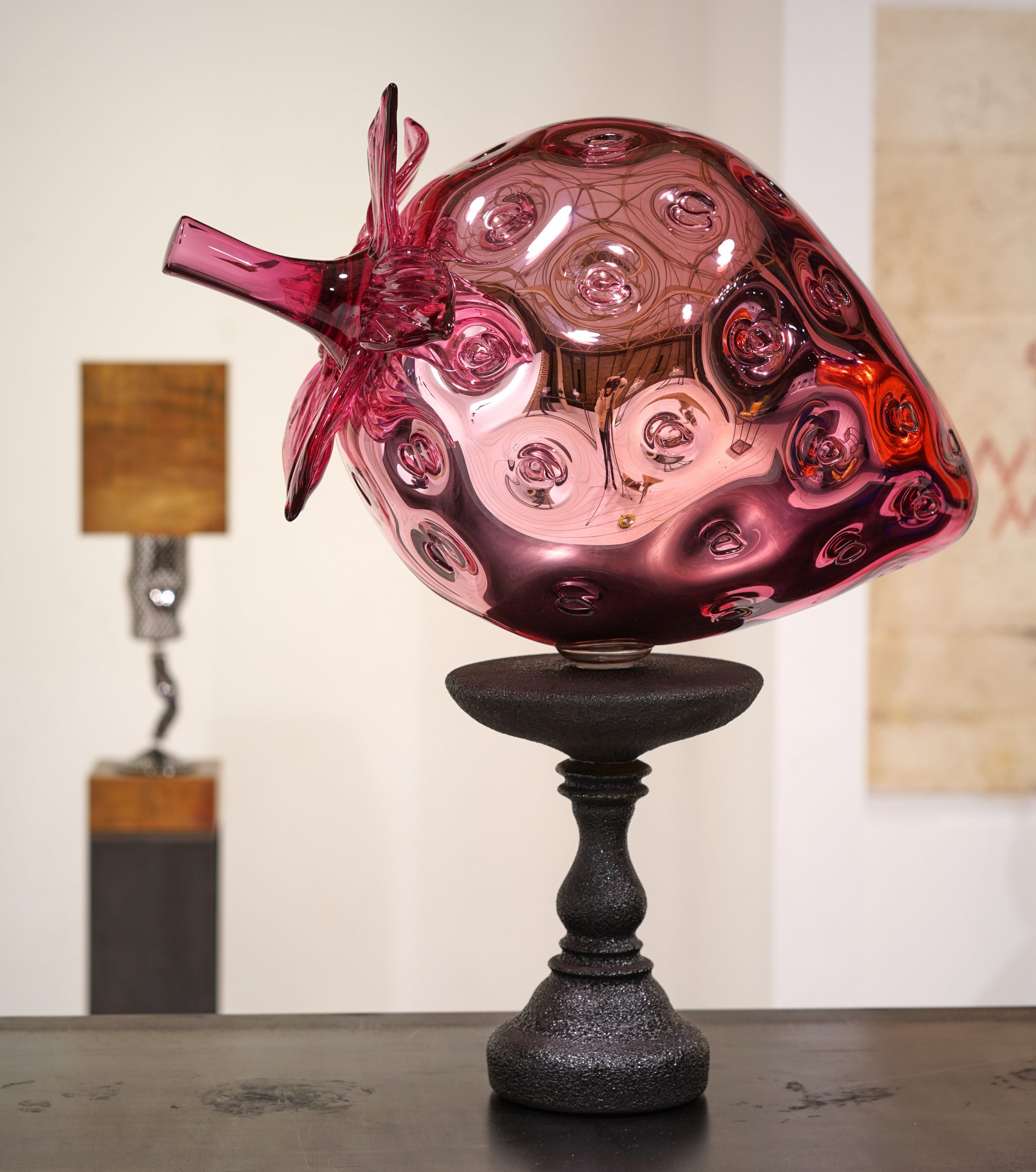
I’ve been thinking about our idealised conception of food – how the farmed strawberries we eat are so unlike the tiny, seed-covered wild ones. For this show, I have made an enormous strawberry and used a mirroring technique to make it look obscene. Then there’s a triptych of seafood that uses clear glass to comment on the bleaching of coral reefs.
 Could you tell me about the tableware in the display?
Goblet construction is the height of technical glassmaking, and glassmakers often display many identical ones together. I’ve turned that idea into a sculpture: I’ve made 20 wall-mounted goblets using the traditional reticello technique, but then crushed them down between two concrete blocks until they are distorted, and displayed them on the wall.
The virtual exhibition Elliot Walker: Plenty runs until 13 February. This interview is an updated extract from Crafts magazine’s January/February issue
Interview courtesy of the Crafts Council and Crafts magazine.
Read more about Elliot in The Telegraph
by Polly Pentreath
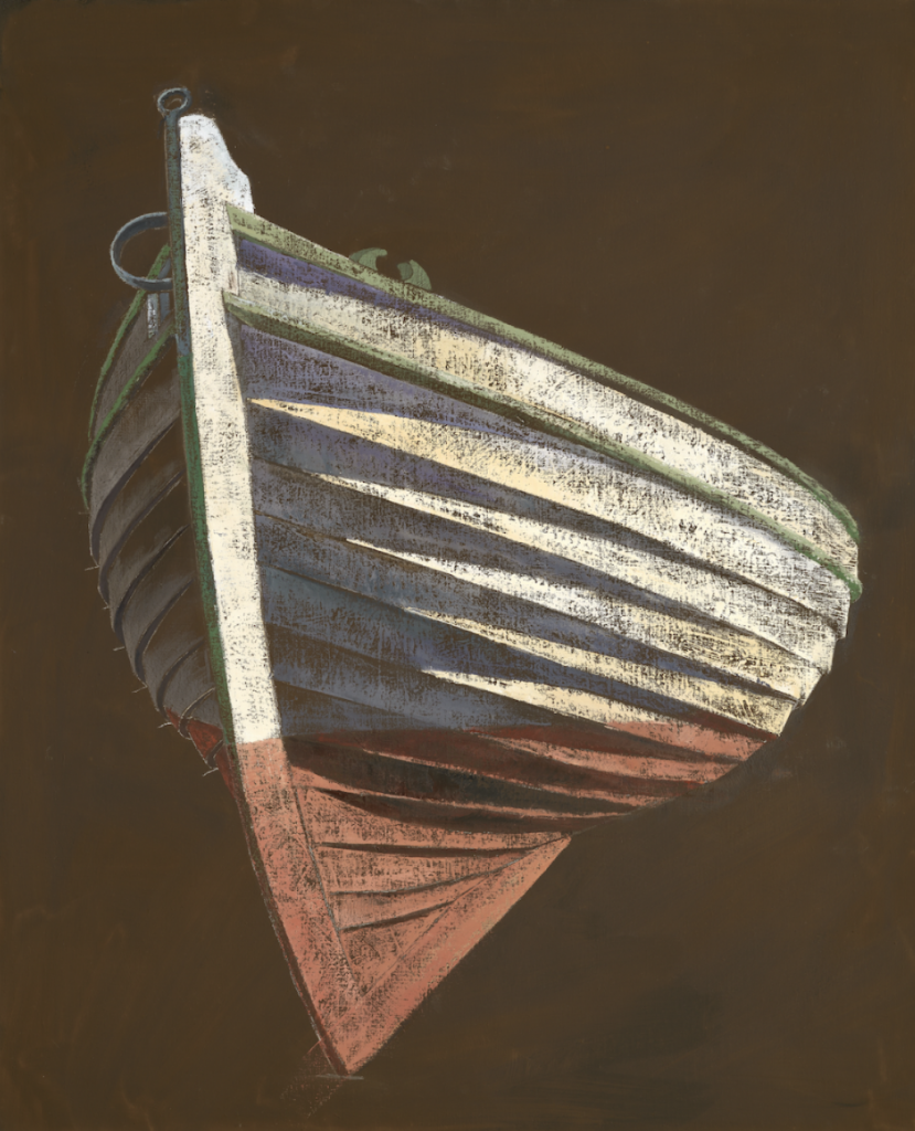
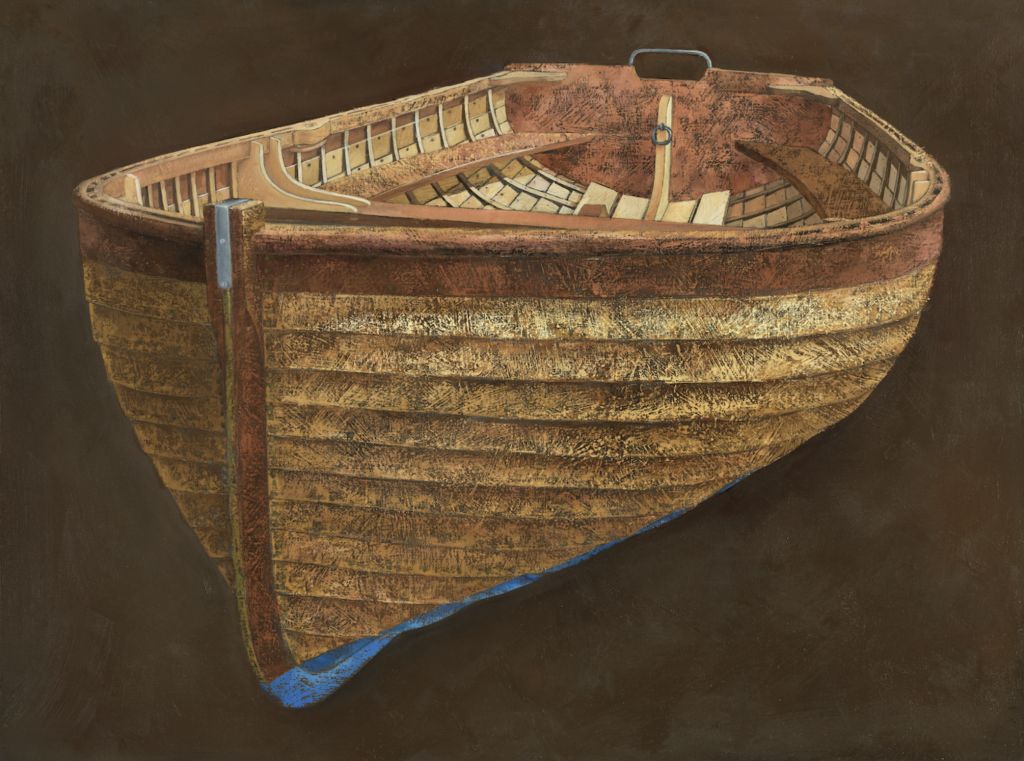
James Dodds “Jette”, 2020
A white boat with a red hull looms out from a wash of deep brown. It is built of curved
wooden slats that turn a buttery yellow in the light and purple in the shadow. The darkest
shadows disappear into the deep brown of the background, while highlights are picked up in
turquoise. Jette is exemplary of James Dodds’ boat paintings, which show wooden vessels in
various stages of completion. The exact draughtsmanship shows James’ mastery of his
subject and they resemble architectural plans in their accuracy and precision. Yet his
paintings are more than recordings of the boat-building process. The vessels are viewed
from strange angles and suspended over great plains of colour. The underlying drawing is
filled in with unexpected combinations of colour and the surface scraped back with a palette
knife.
Jette is a Danish boat built in the USA. James has studied boats from all over the British Isles
but his reach extends far beyond our coastline. He approaches these boats like an
anthropologist, noticing the peculiarities and similarities of different regions and revealing
shared histories. He became interested in Danish boats after visiting the country and
observing similarities to boats in Norfolk. These resemblances originate with the historic
North Sea crossings of the Vikings and James goes further to contend that all clinker-built
boats around the British Isles are derived from Viking vessels.
The painting of Jette sits between a portrait of a living vessel or a plan of a boat to be.
Sketch lines are left visible, reminding us of the boat’s beginning on the drawing board.
These lines jar with the physicality the boat, which looms out over the viewer as if already
making way to the water. The light glaring on the side is real – bright sunlight on a clear day.
The distressed surface, scratched and scraped back with a palette knife, speaks to a lifetime
spent at sea. The whole history of this small boat is here; it’s ancestry in Denmark, the
drawn plans on paper, later the workshop, and years from now, it’s future at sea.
If you’d like to know more about James Dodds and his boats, sign up to our newsletter to be kept up to date
by Lucy Reis

When observing Antony Williams’ new still lives one hears the echoes of Italian churches and smells the faint scent of incense in the air. Akin to a fresco by Piero della Francesca suspended in eternal stillness these paintings are quietly contemplative. Like Piero della Francesca they are an infinite scene from a play behind a curtain that never goes down, however, they are the outcome of a more contemporary perspective.
Subconsciously at first, time is stretched a little by Antony Williams’ paintings. There is a stillness of times passing observed, it is not just the dawn like moment of the early renaissance painting that seems to be present. It is the method itself, the mark making one on top of the other, repeatedly, that seem to encapsulate time spent in observing. The effect on our transient viewing, whether in passing or in study is to become increasingly aware that as much as these are works of observation they are also visual odes to time.
Their unusual quality relies upon the viewers suspension of disbelief in a medium of high reality. These series of small still lifes focus on the dichotomy between organic matter and the geometry of architecture. Australian seed heads are tucked behind the doors of a Victorian dolls house and appear out of the roof, oddly disproportionate within its surroundings.

Detail of work in progress
There are several points of differences here to grapple with from the geometric versus the organic to high reality versus the unexpected surreal. These studies bring architecture down to a scale where it becomes fragile, suddenly you are looking at a world that that could be destroyed by a wrong foot.
These are not simply a collection of objects but are composed in a way that conveys intensity in scale despite their size. Antony’s technique of mark-making records such a potency of information that they explode out of their dimensions.
Antony begins his day with the same ritualistic routine, that of mixing the raw pigments to create his palette. Dictated by the day’s work ahead of him Antony creates and controls the palette he needs
Known for depicting some of the world’s biggest names and art collectors, Antony is associated with unflinching depictions of people whose reputations and celebrity proceed them. In these small paintings Antony is free to become absorbed by his personal pre-occupations and the surfaces and juxtapositions that captures his imagination. They have a presence beyond their size and will be displayed with equal reverence to Antony’s full-scale portraits.
Antony’s still-lives will be on view as part of his 2021 exhibition at Messums London. Sign up to find out more
by Lucy Reis

Sometime in the 1600’s, somewhere in the Netherlands, silver platters are teetering on a darkly lit oak table. Bunches of peaches and plumbs spill over the silverware onto the satin cloths. A dead pheasant gazes forlornly into the middle distance and a lobster looks slightly bored as it’s antennae prods a peeled orange. A wicker basket overloads with grapes and a dead butterfly is glued to a fig.
Around four hundred years later in a dingy pub that smells strongly of beer and sticky carpets, football plays on a large screen as someone orders a ‘surf and turf’ that will inevitably taste of de-frosted plastic.
Better than the Dutch masters, more gluttonous than the upper classes of the 1600’s and as ironic as the pub classic, the namesake of his new work, Elliot Walker draws up a seat at the proverbial feast and assuredly becomes the loudest voice in the room.
In a medium commonly associated with daintiness and refined decorative fragility Walker clears this table with confidence. It suits him that his latest narrative in glass is one of excess, sensory gluttony, and, in terms of technique, a challenge that throws down the gauntlet to the glass blowing world.
Back at our feast, frozen in time in the sixteenth century, one could reach through the ornate gold picture frame and touch the soft flesh of the peaches and feel the cool goblets, the wine looks so intoxicating it fills the twentieth century nostril. Walker’s Surf ’n’ Turf offering invites a warier feaster to the table. More artifice than natural this feast will never rot, there are no flies on this table. There is nothing soft about this abandoned dinner party.
Away from the glinting light refracting off these extraordinary objects there is an underside of darkness. Walker points out that ‘the vitrification of materials is a common occurrence at sites of great calamity’. There is a sense of abandonment at this particular dinner party. A vitrification, or fossilisation, moments before a disaster of grand scale, the guests running for cover as molten pumice and ash rain down, freezing a scene of apparent serenity forever. In a dark parody of the Dutch still life this display nods to the perpetual scene of bountiful life and flips it on its head.
Want to read more? Sign up to our newsletter to be keep up to date with our latest news and insight
An essay by Philip Marsden
A February gale had just gone through when James and Catherine Dodds came to visit. The gale had broken the mooring of my little Cornish coble and left it on a beach some way upstream. The boat was undamaged but I’d just been down at the creek, fumbling in the low-water gloop to fix a new length of ground chain to the block.
‘I won’t shake your hand,’ I held up my own to greet them. It was covered in mud, as were my boots and trousers, my coat – probably also my face and hair.
‘That’, said Catherine, ‘is how James looks much of the time at home. Mud is his habitat.’
James smiled, nodding.
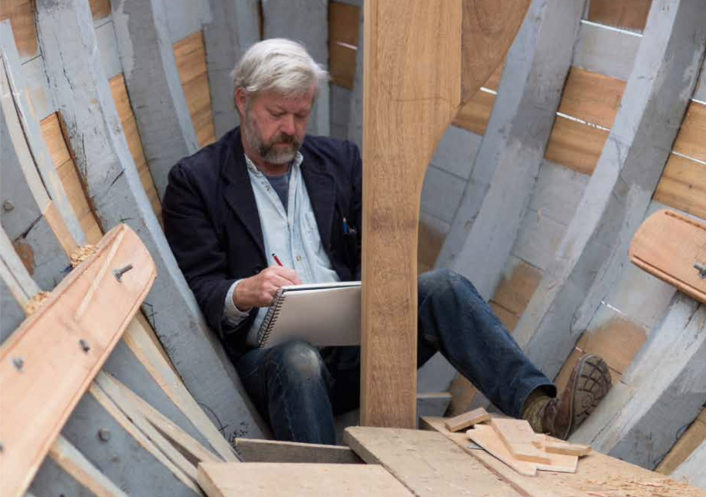
The Fal in Cornwall, the Colne in Essex. Two short rivers flowing into different seas, each with their fine silt banks, their accumulated sediment, each with a world of maritime history packed into its brief estuary. On the Colne, where Dodds has his studio, five thousand ships have been built in the last couple of centuries, fishing boats and freighters and some of the fastest schooners ever to sail the sea. It is as if the mud itself spawned these creatures, which took shape and grew from its slimy flats, to slide off into the tide and fly across the ocean.
Down at Falmouth, tucked in behind Pendennis Castle, is a pool where ships have been sheltering since prehistory, where they’ve been assembled, victualled, re-sparred and repaired, where superyachts are now designed and built. It is a natural harbour that has been as busy with boats as any along the Atlantic seaboard. The National Maritime Museum Cornwall now stands there, on partially-reclaimed land, and in its timber-and-glass gallery was hanging, at the time, this same collection of James Dodds’s paintings and prints. Hence the visit.
I’d been to the gallery the week before. It was my first sight of his pictures in the flesh. His boats filled the space around them with a physicality that took me aback. They were impossible to ignore. In other hands, reality like this might be merely literal or photographic. But not here. Through the vessels’ grainy textures and meticulous forms, bare of any context, James Dodds persuades us to dwell on a simple notion: what a strange and wonderful thing is a boat.
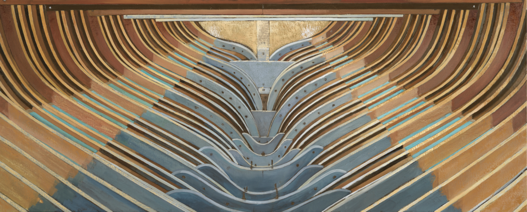
Among the paintings, prominence is given to a group of workboats – Falmouth quay punts, oyster-dredgers, shrimpers and luggers, gigs and tenders and dinghies. Most are painted bow-on, and in their anonymous background they look suspended. These are the foot-soldiers of the maritime army, the inshore corps of jobbing craft. They are not embellished like old ships-of-the-line, nor made sleek like a yacht. They are built for labour, for day fishing, for fetching and carrying – yet each one glows with a nobility that goes far beyond its function.
Joseph Conrad believed that ‘the love that is given to ships is profoundly different from the love men feel for every other work of their hands’. That difference lies at the heart of boat-building, a tradition as old as the first migrations of homo sapiens. Shaping wood for the alien forces of the water requires problem-solving and techniques that equate to little on land. Together they have produced an object that now, after many thousands of years, looks like nothing else. Boats have grown and evolved with us, a companion species like the
Dodds manages to place his boats in that enigmatic space between the animate and the inanimate. They are taut with muscularity, power and strength at rest. It takes little to picture them driving into steep seas, or muled up with supplies or a good haul of fish, or dashing towards a ship to win the pilotage. But they are the work of human hands, designed by an individual’s eye and judgement, nothing more than an inert assemblage of dead timber and metal fastenings.
‘Fowey River Class Dinghy’ 2018
I confess I’m something of a pedant when it comes to boat pictures. I have an annoying tendency to look first at the lines and if they are not quite right, find it hard to look again. But Dodds knows boats, not only as someone who has been on and around them all his life, who lives by the rhythm of the tides, whose habitats include estuary mud – but as a man who trained and worked as a shipwright. He understands the anatomy of boats, the processes that go into creating them – the lofting-out and the half-models and moulds, the string-lines and battens, the framing and scarphing and caulking. And he knows that particular frisson of sea-fear, and the deep trust that every sea-goer places in their vessel.
Among his pictures in Falmouth, I realised for the first time the reasons for my pedantry. I saw why it is so hard to look past an unboat-like shape, why any degree of abstraction of wooden craft feels wrong. It is because a boat’s shape is already an abstraction. In its build – the bend and sheer of the hull, the rise of the stem, the ogee or lute of the transom – the form of a waterborne vessel is far removed from the familiar. It is as weird as any work of art, and as true. To alter or distort the lines would be to diminish it. What James Dodds does is less interpretation than homage.
We were sitting in the kitchen, talking boats. We spoke about my other boat, a 31-foot wooden sloop, now winter-covered in a creek to the south, and built over fifty years ago near Dodds’s home in Essex. We spoke about the oak frames and fittings and its character at sea, my recent navigation up the west coast of Ireland. We spoke about the various boats he had had, and about his print-making and his proofing press and how he prepared for the paintings – the laying out, the scaling-up and the intricate geometry of the sketching. ‘I tend to approach the painting of a boat as if I was building it.’
One thing that struck me about the boat images was their texture. The hulls’ surfaces have a quality that is far from real, yet appears completely authentic. Dodds builds up the paint from a dark ground, adding pigment layer by layer and then scraping it back with a curved skinning knife. The colours too are slight enhancements – stronger, brighter than anything you might see used in a boatshed. But rather than deviations, they help to emphasize the principal intent: to present the beauty and mystery of the boats’ form.
‘Look at the angle,’ we were leafing through a catalogue, Dodds pointing out the aspect of many of the images. ‘I like to position the boats so that a part of the interior is hidden, and there’s a slight glow from inside, from the space you cannot see.’
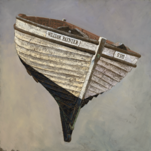
‘St. Ives Lugger, William Paynter’ 2020
There’s an absence in these paintings. It’s not clear at first, but spend a few minutes with them and you become aware of what’s missing: the hand that shaped the boats, that planned and constructed them, the town beaches they lay on, the crews that heaved them into the water. For all their paint-craft and shipwrights’ method, these pictures tell a human story. ‘I often think of particular people as I paint. My father, for instance – he’s there in the grey boat.’
In his omission, Dodds only makes the boats more miraculous. What might be ignored on the strand, an old hulk rotting in the mud, or a clinker-built dinghy well-worked and retired, is displayed here in all its original purity and grace. The story of these craft is pared-back, the role of the characters all the stronger for being elsewhere.
In 1856, John Ruskin made an extraordinary confession. This high Victorian aesthete, more at home among the vaulted cloisters of a Gothic cathedral or the masters of Renaissance painting, wrote in middle age:
‘Of all things, living or lifeless, upon this strange earth, there is but one which, having reached the mid-term of appointed human endurance on it, I still regard with unmitigated amazement… Flowers open, and stars rise, and it seems to me they could have done no less… But one object there is still, which I never pass without the renewed wonder of childhood, and that is the bow of a Boat.’
Like Dodds, Ruskin recognized the perfection of a boat’s shape, the life-giving union of form and function. He saw its apogee in the front end – the bringing-in of planks at the stem. In that detail is the core of the task: the diverting of natural materials into curves and containment. The bow must be sharp to cut through the water, but the boards must spread back from it, filling out to create volume, and they must do so in such a way that copes with the ever-shifting bumps and thrusts of the water. If it looks beautiful, that is only a measure of its rightness.
But a boat’s bow is more than just shape. ‘No other work of human hands,’ continued Ruskin, ‘ever gained so much.’ Over the centuries, boats have acted as the engine of human endeavour, hidden away beneath the bottom-boards of history. Look around you – how much has been brought by sea? On island Britain, boat-building always meant connecting – or re-connecting – with the world and its peoples. While some vessels put to sea to do ill – carrying slaves, subjugating nations or making war – a great many more were involved in the intermingling of people, in the fertile exchange of goods and ideas, in the invigorating flow of migration and emigration. ‘The nails that fasten together the boat’s bow,’ Ruskin concluded, ‘are the rivets of the fellowship of the world.’
Boats reveal the best of us. Every one carries the ingenuity of those who designed and constructed it, the courage of those who worked it, and each carries too the efforts of all those previous generations for whom the barrier of the sea was no impediment, whose restless souls drove them to leave the comforts of the shore to seek bounty beyond. Boats reveal the best of us, and James Dodds’s boats are the best of them.
‘New Quay Punt, looking aft’ 2020
An essay by Catherine Milner

‘The voyage of discovery is not in seeking new landscapes but in having new eyes,’ said Marcel Proust and at the moment, the effects of that thought can be seen as not just philosophical but also practical.
In the absence of ready and immediate travel many of us have started to enjoy what we see around us; discovering a new Eden in what we have already before our eyes.
Years of metropolitan culture; going to nightclubs, restaurants, shops, galleries and increasingly arcane coffee shops seem to have been exchanged in the blink of an eye by such prosaic activities as walking and gardening.
The landscape, so long seen as a backdrop to our lives, has taken centre stage; Nature and its wonders, objects of curiosity increasingly demanding our attention and being talked about.
So, it is no surprise that a new school of landscape painters has emerged. In truth it has always been there but, obscured by the noise surrounding the industrial and technological advances we have made, we did not much hear its quiet beat.
Britain’s landscape painting tradition – much like the landscape itself – is one of the best preserved in the world.
It has emerged and disappeared as a genre every few decades since the 18th century when painters like JMW Turner or Thomas Gainsborough first began to celebrate it.
The Pre-Raphaelites; the Newlyn School, to some extent the Bloomsberries, the Nash brothers, the St Ives Group and latterly artists like David Inshaw and Michael Andrews have all sought to express the charm of our island, often following or coinciding with a period of intense industrialisation or war; William Morris’ wallpaper designs featuring banks of peonies or John Nash’s pre-war paintings of bucolic haystooks are just some examples of many escapes into arcadia.
And although landscape painting has been out of the mainstream for years there have been signs even before the onset of this pandemic, with technology was riding high and society increasingly atomised, that the embers of our love affair with landscape had begun to smoulder anew.
Leading painters, Hurvin Anderson, Peter Doig and Luc Tuymans have made landscape a central feature in their work for decades but often at a distance, in a slightly alienated way.
Now, as our roster of new exhibitions show, the landscape is seen as welcoming – not bleached of its colour, inpenetrable or fenced off but drawing us in, reminding us that we are at one with it.
Messums’ exhibitions this winter give us many new perspectives on the landscape; all through the medium of paint, that – much like landscape – comes in and out of fashion but in the end, scotches all rivals.
Richard Hoare’s pictures of Wiltshire and Dorset speak of the light behind all we see; the light that leads to photosynthesis, creating leaves on the trees and fostering all life. He depicts a world in constant motion – fluttering with life – capturing the abundance and fruitfulness of the southwest of England.
Constable once said that the sky sets the tone for any landscape painting and this is the striking feature of paintings by Hannah Mooney; her rich peat-coloured, crepuscular paintings of the lakes of County Mayo and the West of Ireland have a dark romanticism and contrast with the diaphanous, gossamer-thin watercolours of northern Italy by another of our rising stars, Francesco Poiana.
Situated in a 13th century medieval wooden barn constructed from vast trunks of elm and oak Messums Wiltshire can sometimes feel akin to being in a big forest. This year the paintings, more than ever, feel as if they are the lights.
Image 2. Detail of ‘Trees by Lake at Night – Fonthill’, Monotype Drawing by Richard Hoare
